
Context
This student redesign reimagines the visual identity of Manic Panic, a semi-permanent alternative hair dye brand, for a modern audience while paying homage to its authentic punk legacy. It consists of a logo, packaging, and marketing strategy redesign.
Brand background
Founded by two sisters at the heart of New York's 70s punk movement, Manic Panic pioneered vivid hair colour and built a cult following through deep ties to the punk, drag, and music scenes.
The problem
In today's beauty world, discovery is increasingly driven by algorithms and influencers. Newer, sleeker, platform-optimized competitors have pulled ahead, leaving Manic Panic harder to discover among younger demographics.
And while iconic to older followers, its cluttered visual identity can read as tacky and outdated to younger eyes, undermining the premium quality the product actually delivers.

My redesign
Old Logo

New Logo

Analysis
Made by punks, for punks
Reflected in product names like the "Aging Disgracefully" collection and a commitment to donating 10% of profits to charity, Manic Panic's personality is defined by punk: edgy, rebellious, and activist. Their audience spans creatively-oriented young and older alternative women.
Competitor analysis
Arctic Fox is a younger hair dye brand, founded in 2013. Manic Panic and Arctic Fox are surprisingly close in size and net worth, despite the almost 40 year age gap.
While Manic Panic is considered as the classic punk pioneer of vibrant hair dye, Arctic Fox has grown rapidly as a modern social media favourite.


In a Sally Beauty store, Arctic Fox overshadows Manic Panic. It's the first visible product in the semi-permanent hair dye aisle, placed at eye level.
Meanwhile, Manic Panic is further in and further down, relying on its legacy to bring customers towards it.
UX challenges
The packaging label design, while historically iconic, appears cluttered and hard to read. The text hierarchy and typography are both very inconsistent and confusing to navigate. Dense elements compete for attention instead of guiding the eye. Additionally, the logo's bright red colour can clash with certain dye shades and disrupt the colour harmony.

The written instructions are also long, tiny, and hard to quickly skim. The top mentions more instructions, which unintuitively hides underneath the sticker. They also don't include an estimate of how much hair one jar will cover, which can cause customer uncertainty and hesitation.

Certified by culture, not trends
While new brands grow rapidly in digital spaces, Manic Panic's strength lies in its authentic heritage and deep cultural connections with alternative communities.
Drained by large corporate and "clean girl" aesthetics, consumer sentiment is shifting back to
valuing originality, nostalgia, and meaningful identity. "Vintage" and "messy girl" is in.
The moment is perfect for Manic Panic to reclaim its spot as vivid hair dye's defining force.
Development
Conceptualization

Good design stems from mind-numbing amounts of brainstorming. In my process, I played into Manic Panic's themes of veganism, NYC punk, and an overall sense of defiant edginess.
The cat

Inspired by their animal-loving charity history, I explored different ways I could implement a personable black cat mascot. I started off wide, then evolved my sketches through refining and narrowing down those initial ideas.
Pros
Personable mascot
Ties to vegan and cruelty-free brand values
Cons
Unobvious "MP" letters
Little correlation between cat and the name "Manic Panic"
The liberty skull

Leaning into Manic Panic's New York roots, I merged the Statue of Liberty's iconic crown with the sharp, defiant liberty spikes of punk culture, creating a symbol that lives at the intersection of both worlds. I juggled with hair-relevant iterations and integrating letters.
Pros
Aligns with edgy brand personality
Simultaneous nod to punk history and brand birthplace
Cons
Edgy skull messaging might come off strong and overused
Combination mark logo

The third route I took was playing around with wordmarks and pictorial logos to make combination marks. I continued the symbolism of skulls and liberty spikes while experimenting with other symbols of punk culture like fabric pins and stars.
Final iteration
Liberty skull x wordmark logo


I iterated upon my combination mark logos, combining the liberty skull's side profile with distinct typography. This redesign fuses modern aesthetics while embracing Manic Panic's NYC punk roots.


I continued to revise my concept logo inside Adobe Illustrator, comparing different styles of typography and skull design. Eventually, I departed from the sharp, inclined aesthetic and settled on a more rounded style to keep the design sleek, while still conveying a sense of creative expression.
Design system
Standardizing for scalability

The standard colours are bold red, deep blue, and organic cream — however, the palette remains flexible to account for the large range of hair colours Manic Panic offers.
Colourway for Hot Hot Pink

Final redesign
Real Culture, Real Colour


Marketing
Analyzing current social media trends, I produced 3 different example video concepts with Adobe Firefly and Premiere Pro to elevate Manic Panic's weak online presence.
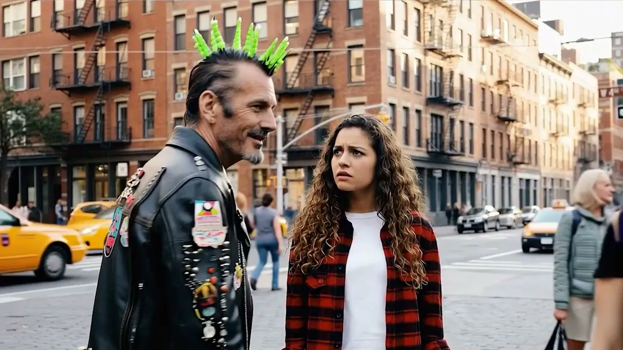
Embracing legacy
Manic Panic pioneering vivid hair dye is a competitive advantage newer brands can't replicate. Educating younger consumers on the brand's origins builds credibility and emotional connection to a history worth knowing.
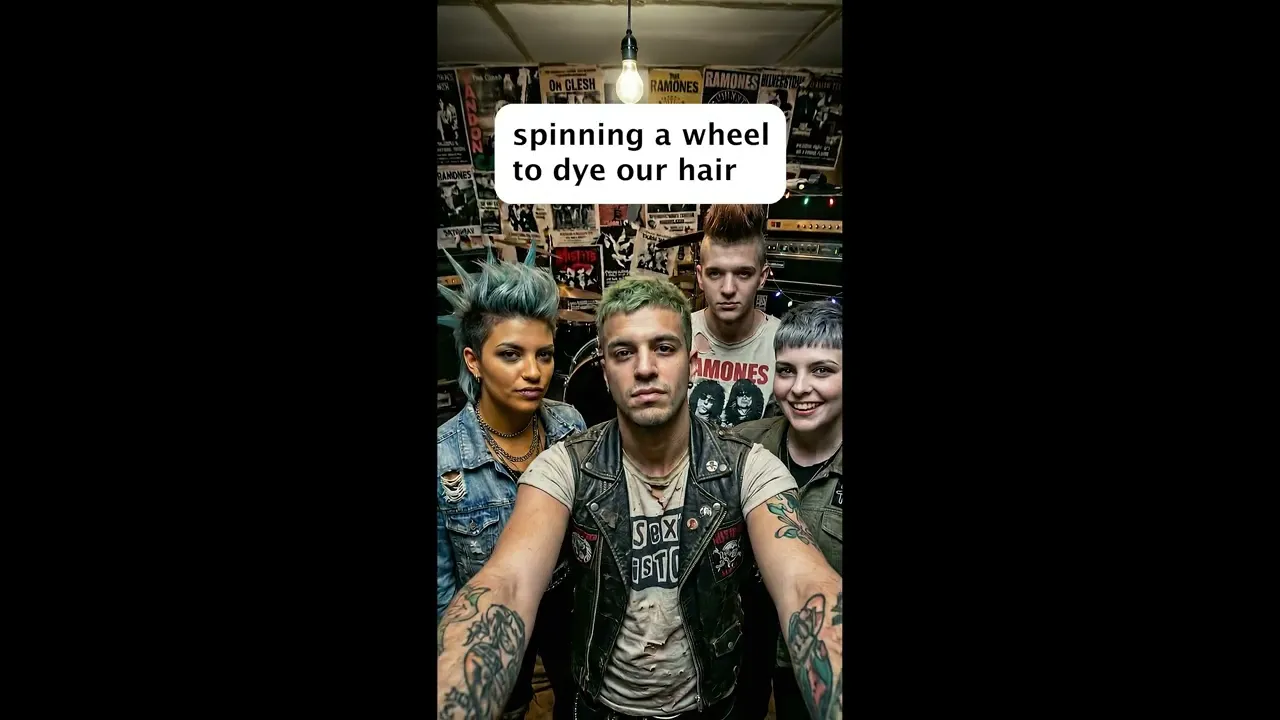
Community ties
Manic Panic has historically had deep connections with alt communities. Supporting and organizing collaborations can encourage name recognition and loyalty. For example, collaborating with a punk band and exchanging followers.
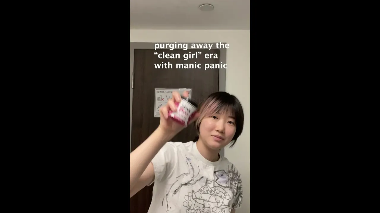
#messygirl
Younger audiences are getting tired of seeing clinical and superficial content. The rise of the 2026 "messy girl" aesthetic signals a growing demand for authenticity.
Manic Panic can tap this momentum by posting raw, behind-the-scenes dyeing videos that showcase the messy, human process.
Takeaways
What I learned
Know before you change
Manic Panic's iconic cult legacy and personality made every design decision deliberate. Understanding what was iconic and essential to the brand's identity versus what was outdated required research before instinct.
You can't change what you don't fully understand first.
Trust the process
Hitting standstills in the brainstorm phase is frustrating, but each one of my breakthroughs came from continuously following one small lead to the next.
There are no dead ends; have faith that there will always be a solution, and iteration will bring you closer to it.
